My previous article was about the moment I decided to become a part-time freelancer. A lot has happened since then and two of the things I needed to do in the beginning was decide on a company name and get a logo designed.
My two sisters have had to endure a few sessions of the Spanish Inquisition. I was throwing ideas left right and centre and they were one of the first ones to approve, adjust or simply say 'why would you do that?'. I was talking out loud trying to explain my business concept when the letters SOS popped up on my screen. Continuing from there we were talking about the various ways to use these letters. One of my sisters has a graphic background and plopped out a few designs before I could even blink. I sent a few of them around to friends and family asking their opinions and as you can see below, there were a few trial and errors before I decided which one to use.
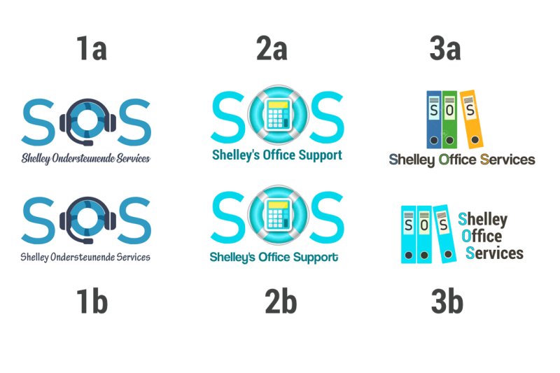
I believe a logo is like buying a house. It is for the long term but can be adjusted in time. If there are too many questions or unsuraties then don't do it. I fell in love with the house we are living in now and I felt the same about this logo. It is simple & clear and 'shows' what I do (hopefully you all saw the keyboard keys in there ;) ).
The final result can now be seen below and on all of my official correspondence: website, letterhead and soon to be printed business cards.
An extra shout-out to my sisters again.
Reactie plaatsen
Reacties